Stop Leaving Money Inside Your A+ Content
Strong traffic with weak sales is one of the most common Amazon headaches. Your product ranks, shoppers click, but the conversions stall. Often, the silent leak is not your title, not your main image, and not even your ads. It is flat, confusing, or cluttered Amazon Enhanced Brand Content sitting right under your bullets.
This part of the page is where buyers slow down and decide. When it is done well, it clears up doubts, shows value fast, and nudges people to add to cart. When it is done poorly, shoppers back out and go compare other listings instead of buying from you.
The first half of the year is a great time to fix this. Post-holiday reviews, tax refund shoppers, spring sales, and warmer weather buying spurts create extra traffic. Cleaning up your A+ layouts before big events like Prime Day and mid-year promos means every new click has a better chance to convert.
At ZonHack, we see brands lose real money inside this section alone. Not from low ad spend, but from layouts that hide benefits, confuse buyers, and miss easy cross-sell chances. In this guide, we will walk through common layout mistakes, how to think about missed revenue, and simple layout flows that turn casual browsers into confident buyers.
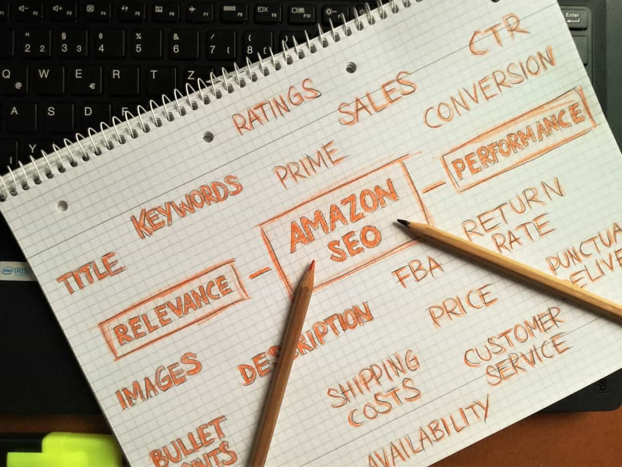
Why Amazon Enhanced Brand Content Is a Revenue Engine
Amazon Enhanced Brand Content, or A+ Content, replaces that long, plain text description with a custom layout made of images, graphics, and text modules you control. It is where you can tell your story, explain features clearly, and show your product in real life.
This space drives revenue in three big ways:
- Higher conversion rate, because buyers understand the product faster
- Higher average order value, when you use it to show related products and bundles
- Better reviews and fewer returns, because expectations are set correctly
When shoppers stay on your page longer and convert at a higher rate, the algorithm pays attention. Strong A+ Content supports:
- Better organic rankings over time
- More stable PPC performance
- Lower cost per sale, since traffic converts more often
This matters even more in crowded spring and summer categories. Outdoor gear, home refresh products, fitness items, and seasonal accessories all attract comparison shoppers. They open several tabs, scroll fast, and pick the listing that makes the choice feel simple and safe. A+ is where that decision really happens.
Hidden Layout Mistakes That Kill Conversions
A common issue we see is the “wall of images” layout. Brands fill every module with busy graphics, tiny text, and lots of colors, thinking more content will sell more. What the buyer sees is noise. Benefits are buried, questions are not clearly answered, and the shopper has to work hard to understand what makes this product right for them.
Some of the most common layout errors include:
- Inconsistent image sizing that makes the page feel messy
- Text that is too small to read on mobile devices
- Low-contrast colors like light gray text on pale backgrounds
- Lifestyle shots that look pretty but do not show use, size, or key details
Another big problem is poor sequencing. Many brands lead with a long brand story, then talk about benefits later. Shoppers are there to solve a problem first. If they have to scroll past a full history lesson before they see proof, features, and clear differentiation, they often bounce.
Accessibility and mobile issues also hurt conversions, especially when buyers are browsing on the go:
- Dense text blocks that are hard to scan with a thumb
- Important text baked into images, which cannot be translated or read by screen readers
- Layouts designed on desktop that fall apart in a single-column mobile view
When someone in a warm, humid place like Texas is shopping for home items or outdoor gear between errands, they will not pinch and zoom just to read your copy. If your A+ is not effortless on mobile, you are leaking revenue.
Structuring A+ Content for Fast Buyer Decisions
To fix these leaks, we like to think in terms of flow. A strong, conversion-focused layout follows the way real buyers think. One simple layout order looks like this:
1. Hero benefit module
2. Problem and solution strip
3. Feature grid
4. Social proof
5. Brand story as the closer, not the opener
Each module should have a clear job, such as:
- Trust: guarantees, badges, certifications, or quality cues
- Clarity: dimensions, compatibility, size charts, before and after views
- Differentiation: comparison charts that show why your product is different
- Emotion: lifestyle images that show how it feels to own and use the product
Layer your copy so buyers can scan fast:
- A bold, simple headline that states the main promise
- A few icons or short bullets that highlight key benefits
- Short supporting text for people who want more detail
Design for mobile first. That means planning for a single column, thinking about what shows up near the top, and making sure your biggest claims live in real text, not just in graphics. This helps with search, accessibility, and anyone reading on a small screen in bright sun or low light.
Turning A+ Modules Into Cross-Sell Machines
A+ Content is not only about selling one product. It can also guide shoppers into your full product family. The comparison chart module is perfect for this. Instead of letting buyers wander to competitor listings, keep them in your world by showing:
- Side-by-side related products
- Clear use cases or levels, like basic, advanced, pro
- Simple checkmarks for features so the right choice pops instantly
Visual consistency matters here. Use a steady brand system, similar angles, and clean product family shots. Color-code by use case or line so people can quickly see which option fits their needs. This is especially helpful for shoppers building a whole setup for a patio, kitchen, or home gym as warm weather hits.
Think about placement too. After your main benefit modules have done their job, position complementary items as natural next steps. For example:
- “Complete your setup” suggestions
- “Works best with” accessories
- Seasonal add-ons like covers, refills, or matching pieces
You can also use A+ layouts to feature spring bundles, new product launches, or seasonal colors without reworking your whole listing. A single refreshed module can guide attention to these offers while the main content stays steady.
Measuring the Revenue You Are Leaving on the Table
Before you touch your Amazon Enhanced Brand Content, set a simple baseline. At a minimum, record:
- Sessions
- Unit session percentage (your conversion rate)
- Average order value
- PPC ACoS or cost per sale
Then, adjust one layout flow at a time. Keep your price and main image stable so you can actually see what the A+ change does. Give each test a full buying cycle, usually at least a few weeks, to smooth out daily swings and promo spikes.
When A+ is weak, even small layout fixes often move the needle. Cleaning up the flow, improving mobile readability, and clarifying benefits can stack up into noticeable conversion lifts. Full redesigns in categories where most listings have poor content tend to move things even more, because you suddenly stand out as the “easy” choice.
The ripple effect goes beyond one product. Better conversion feeds better organic rank, steadier PPC results, and a healthier account overall. Clearer expectations usually mean happier customers, stronger reviews, and fewer complaints or returns.
Most brands focus on traffic first, but a listing that sells poorly is like pouring water into a leaky bucket. When your A+ Content works like a skilled sales rep that never sleeps, every click becomes more valuable.
Turn Your Amazon Listing Views Into Loyal Customers
Ready to transform your product pages into high-converting brand showcases? At ZonHack, we design and optimize Amazon enhanced brand content that tells your story clearly and compels shoppers to buy. Share your goals with us and we will map out a tailored content strategy for your catalog. If you are unsure where to start or have specific questions, simply contact us and we will guide you step by step.